


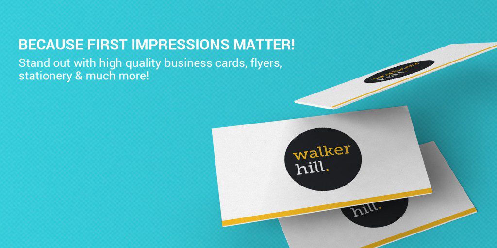
Business Cards
What Your Business Card Signals Before You Speak
Apr
You have a narrow window when you meet someone: long before they read your email address, their hands and eyes are already forming an opinion. A business card lands in that moment. It carries your business name, sure, but it also carries signals about care, credibility, and whether you are worth remembering.
Cards have worked that way for centuries. This article focus on the psychological side: what happens in the split seconds after someone takes your card.
The physical object matters because trust often starts with touch. A flimsy stock can undercut a strong offer. A crisp edge and consistent finish say you pay attention to detail. That is why professional business card that respects paper weight, coating, and colour accuracy is not just cosmetic. It lines up what people feel with what you want them to believe about your work.
Why your brain decides before your eyes finish reading
Research on haptics and first impressions suggests people link heavier card stock with quality and seriousness. Lighter stock is not automatically wrong, but it needs to match your positioning. A bold creative studio might choose an unusual substrate on purpose. A solicitor or accountant usually benefits from something that feels substantial in the hand.
Consistency also matters. When your mark, typography, and colour choices match what someone already saw online, the card confirms a story instead of starting a new one. That alignment is a quiet form of marketing: it reduces mental effort and makes you easier to recall later.
Colour, contrast, and visual balance
Colour carries association. Deep blues often read as dependable. Warm neutrals can feel approachable. High contrast between background and type helps people capture your contact details in a glance. If you design primarily on screen, remember the finished card will shift slightly versus the screen. Proof on paper when you can.
Keep the graphic balance simple enough that one focal point wins. A busy layout forces the eye to work harder. An elegant card usually gives your name and mark room to breathe. You can mention services or a tagline, but clarity beats decoration.
Designers sometimes reference color in briefs even when the finished piece uses Australian spelling. Whether you say colour or color in conversation, the final piece should use a controlled palette and legible type.
Logo, layout, and contact details people actually use
Your logo should anchor the layout, not fight it. Place it where the eye naturally starts, usually top-left or centre-top for Western readers. Follow with your name and role, then phone and email. Social media handles belong when clients truly reach you there; otherwise they add noise.
Typography is part of the trust signal. A quirky font can work for a life coach or a vintage shop. For health professionals, readability and calm usually beat novelty. Rounded corners can soften an otherwise formal card without looking informal.
Psychologist business card and therapist business card cues
A psychologist business card and a therapist business card face a specific test. They need to feel professional without coldness, and personal without oversharing. Mental health professionals often choose gentle palettes, plenty of white space, and credentials in plain language. A mental health business card might foreground clinic details and booking paths rather than slogans.
If you serve a counselling practice or therapy clinic, think about the waiting room test. Would this card feel appropriate on a reception desk? The same layout principles apply to a life coach or a wellness studio: expertise should read clearly, and the design should soothe rather than shout.
Health professionals and counselling professionals share a common goal: reduce anxiety at first glance. That is where pared-back layout and mindful spacing matter as much as wording.
Simple layouts and memorable restraint
Minimalism is not emptiness. It is prioritisation. A minimalist business card might use one strong typeface, two colours, and a single finish that people notice when they turn it over. Pair that with an elegant line of text or a subtle foil, and you create a memorable object without clutter.
Business card ideas that last tend to be timeless rather than trendy. If you are torn between a loud trend and a restrained layout, ask which version you would still hand out in three years.
QR codes and digital business follow-up
A QR code can link a physical card to a clean page with your contact details, a booking form, or a portfolio. Put it on the back if you want the front to stay human and uncluttered. Digital business tools change, but the card still gives people a physical anchor: the code is a convenience layer, not a replacement for clarity in the layout itself.
Templates, downloads, and when custom production wins
Starting from a business card template is fine for drafts. You can download a file, adjust type, and test hierarchy in Canva or similar tools. Use that pass to experiment with layout options before you commit. Just remember that what looks sharp on a screen may need adjustment for bleed and safe zones at the press.
Custom production shines when you want a specific stock, spot UV, foil, or duplex weight that preset files cannot simulate. Paper proofs help, but they rarely match the impact of high quality production. When your identity needs to feel impactful in person, design tips only get you halfway. The craft is in the materials.
Putting these ideas to work
Strong business card design is not about tricks. It is about aligning what people perceive with what you deliver. Pay attention to weight, finish, colour contrast, and a layout that respects the reader’s time. Connect those choices to your brand story, and you promote trust before the conversation deepens.
Materials and finishes keep evolving. See how these psychological principles show up in current styles in our overview of business card trends for 2026.
FAQ
Why do business cards shape first impressions?
People judge weight, finish, and layout before they read every line. Texture, colour, typography, and spacing all influence trust and recall in those first seconds.
Do colours on a business card really change perception?
Yes. Colour sets an emotional tone and affects contrast and readability. Pair colour choices with your sector norms, then test paper proofs so the result matches what you saw on screen.
Should I add a scannable code to my business card?
It helps when the link leads to a simple, mobile-friendly page. Keep the code sized for easy scanning and consider placing it on the back so the front stays clean and legible.
Are minimalist business cards better?
They are often easier to read and more memorable because they remove noise. A restrained layout works best when every remaining element earns its place.
Ready to order?
When the thinking is clear, the production choices get easier. Browse business card options and finishes and order a sample if you want to feel the stock before you commit.